

引言
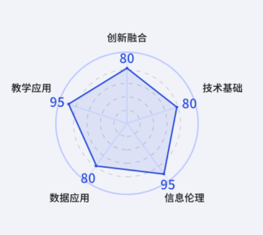
最近在做需求实线时,发现设计稿有个eCharts的图形处理,用的是雷达图,当时没在意,雷达图嘛,eCharts嘛,这不是分分钟就能搞定的事嘛,最后面在做的时候,发现,诶,好像不对劲,设计稿好像在坑我;设计稿的雷达图最外圈的颜色是实线,内圈是虚线,哦豁!这可咋整!
设计稿的样子
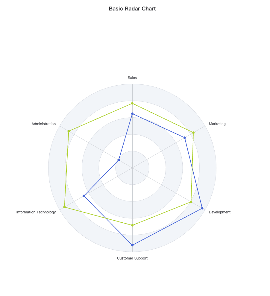
官网雷达图的样子
探索
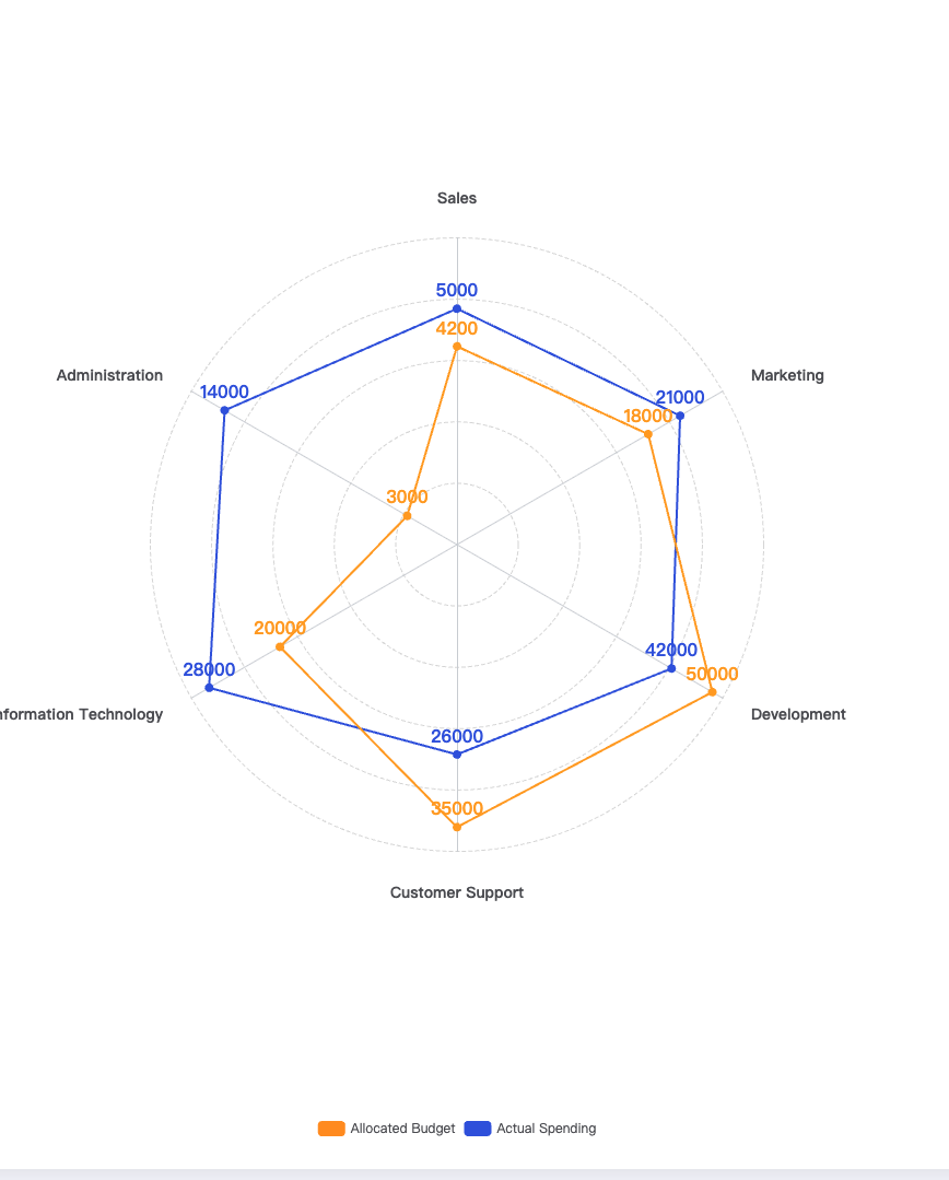
好嘛,既然你能设计出来,肯定是已经有人这样做过了;既然别人能做,我为何不能,于是乎,跑官网去作死的改改改,折腾了一会儿,咦,好像有那么点意思了;现在只是缺个区域颜色、然后外圈设置为实线,好像就差不多了;图例再改一下,与设计稿完美实现;
效果图
代码
option = {
  title: {
    text: 'Basic Radar Chart'
  },
  legend: {
    data: ['Allocated Budget', 'Actual Spending']
  },
  radar: {
    shape: 'circle',
    indicator: [
      { name: 'Sales', max: 6500 },
      { name: 'Administration', max: 16000 },
      { name: 'Information Technology', max: 30000 },
      { name: 'Customer Support', max: 38000 },
      { name: 'Development', max: 52000 },
      { name: 'Marketing', max: 25000 }
    ],
    splitLine: {
      show: true,
      lineStyle: {
        width: 1,
        color: '#dadada',
        type: 'dashed'
      }
    },
    axisNameGap: 30,
    axisName: {
      show: true,
      fontSize: 14,
      fontWeight: 'bold'
    },
    splitArea: {
      show: false
    }
  },
  color: ['#FF9522', '#3459DF'],
  series: [
    {
      name: 'Budget vs spending',
      type: 'radar',
      data: [
        {
          value: [4200, 3000, 20000, 35000, 50000, 18000],
          name: 'Allocated Budget'
        },
        {
          value: [5000, 14000, 28000, 26000, 42000, 21000],
          name: 'Actual Spending'
        }
      ],
      label: {
        show: true,
        position: 'top',
        color: ['#FF9522', '#3459DF'],
        fontSize: 16,
        fontWeight: 'bold'
      }
    }
  ]
};
调优
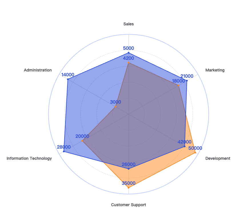
在不屑的努力下,七搞八搞,看了一下官网的配置项,嗯,总算是把区域背景色&图例的位置调好了
效果图
代码
option = {
  title: {
    text: 'Basic Radar Chart'
  },
  legend: {
    data: ['Allocated Budget', 'Actual Spending']
  },
  radar: {
    shape: 'circle',
    indicator: [
      { name: 'Sales', max: 6500 },
      { name: 'Administration', max: 16000 },
      { name: 'Information Technology', max: 30000 },
      { name: 'Customer Support', max: 38000 },
      { name: 'Development', max: 52000 },
      { name: 'Marketing', max: 25000 }
    ],
    splitLine: {
      show: true,
      lineStyle: {
        width: 1,
        color: '#dadada',
        type: 'dashed'
      }
    },
    axisNameGap: 30,
    axisName: {
      show: true,
      fontSize: 14,
      fontWeight: 'bold'
    },
    splitArea: {
      show: false
    }
  },
  legend: {
    show: true,
    data: [
      {
        name: 'Allocated Budget'
      },
      {
        name: 'Actual Spending'
      }
    ],
    top: '80px',
    right: '80px',
    orient: 'vertical',
    icon: 'circle',
    itemWidth: 6,
    itemHeight: 6
  },
  color: ['#FF9522', '#3459DF'],
  series: [
    {
      name: 'Budget vs spending',
      type: 'radar',
      data: [
        {
          value: [4200, 3000, 20000, 35000, 50000, 18000],
          name: 'Allocated Budget',
          itemStyle: {
            color: '#FF9522'
          },
          areaStyle: {
            opacity: 0.5
          },
          symbol: 'circle',
          symbolSize: 6
        },
        {
          value: [5000, 14000, 28000, 26000, 42000, 21000],
          name: 'Actual Spending',
          itemStyle: {
            color: '#3459DF'
          },
          areaStyle: {
            opacity: 0.5
          },
          symbol: 'circle',
          symbolSize: 6
        }
      ],
      label: {
        show: true,
        position: 'top',
        color: ['#FF9522', '#3459DF'],
        fontSize: 16,
        fontWeight: 'bold'
      }
    }
  ]
};
挑战
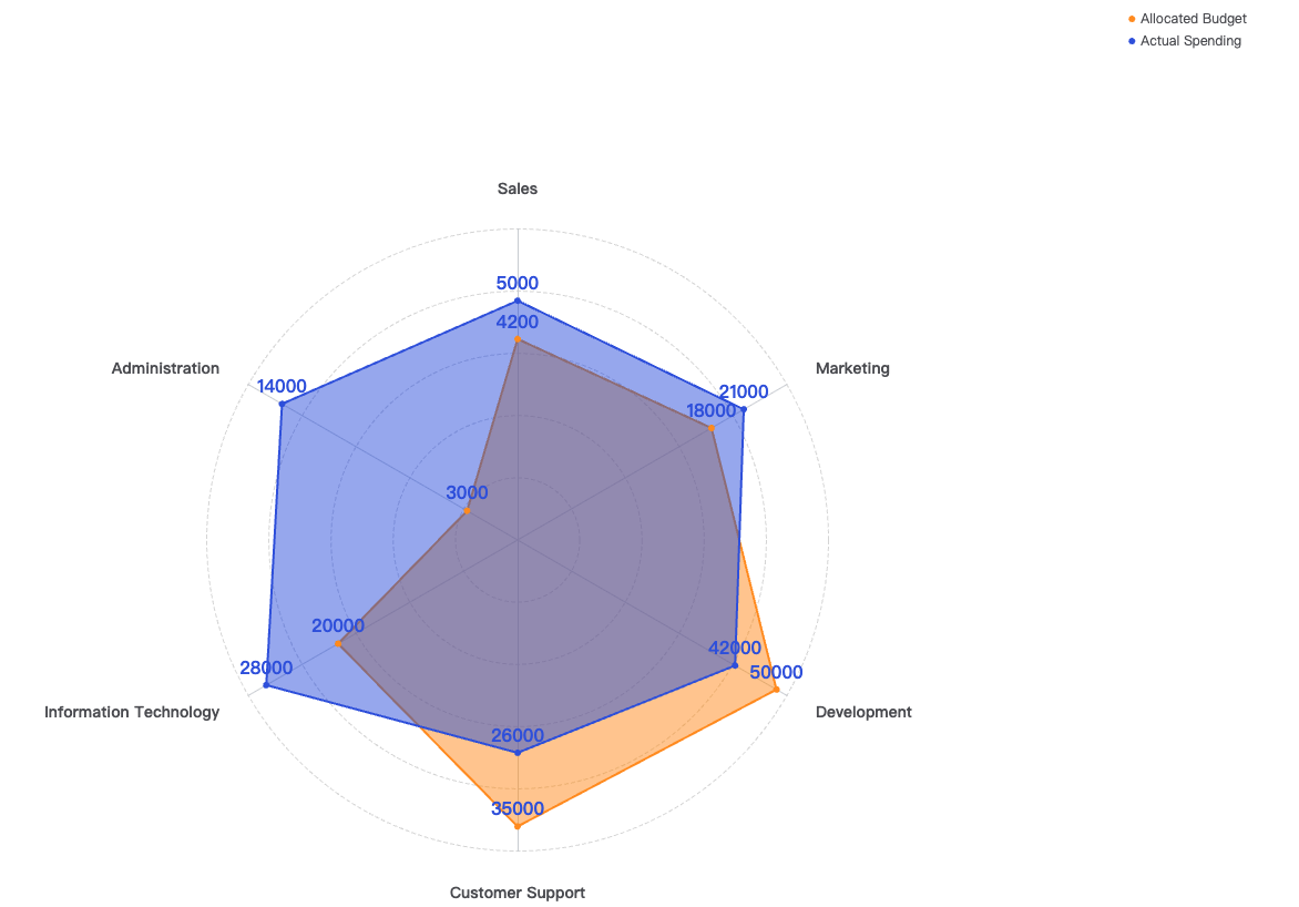
好,现在基本的需求已经实线了,现在就只差一个外圈的实线要处理了;于是乎,又去翻官网的配置项手册;突然间发现
radar的属性居然可以是一个数组;那于是乎,我就有那么一个想法了;是不是可以配置两个radar对象进去,一个是内圈的虚线样式,一个是外圈的实线样式,好,说干就干。
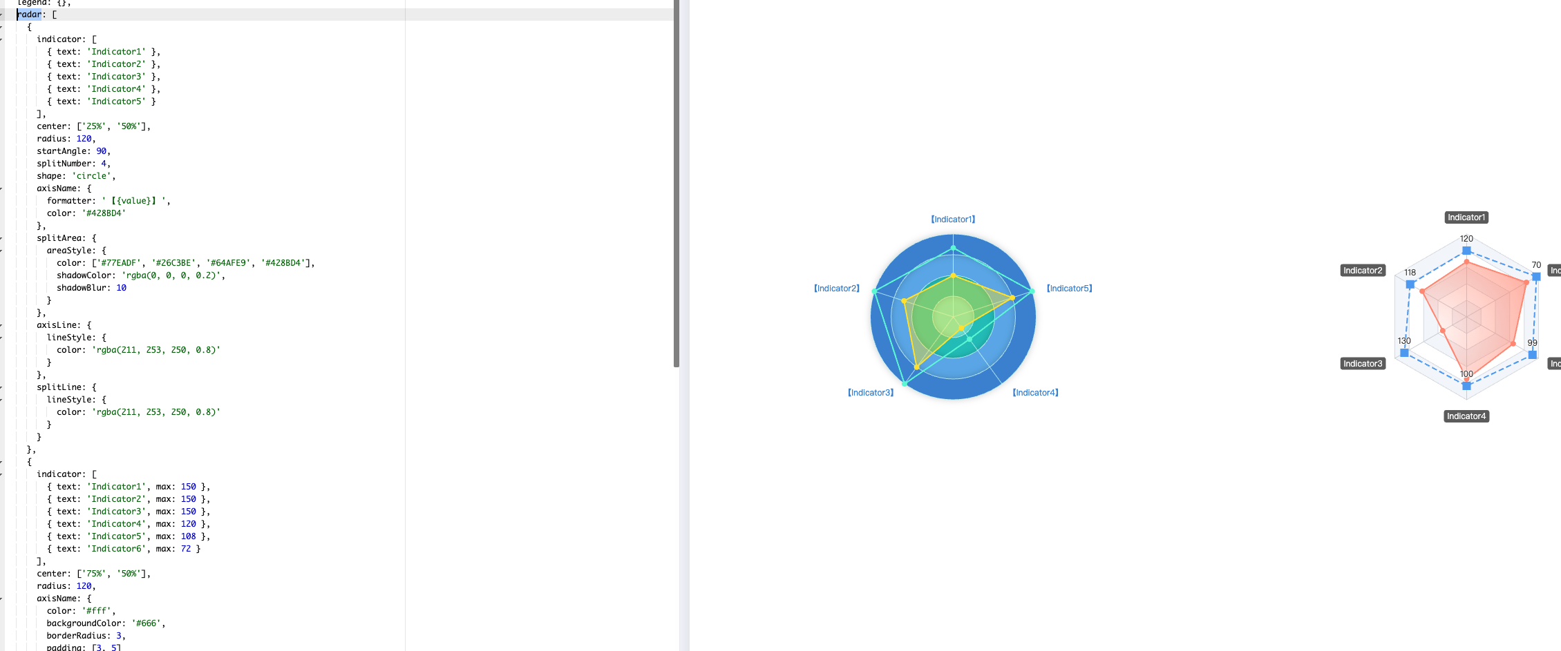
实际效果
代码
option = {
  title: {
    text: 'Basic Radar Chart'
  },
  legend: {
    data: ['Allocated Budget', 'Actual Spending']
  },
  radar: [
    {
      shape: 'circle',
      indicator: [
        { name: 'Sales', max: 6500 },
        { name: 'Administration', max: 16000 },
        { name: 'Information Technology', max: 30000 },
        { name: 'Customer Support', max: 38000 },
        { name: 'Development', max: 52000 },
        { name: 'Marketing', max: 25000 }
      ],
      splitLine: {
        show: true,
        lineStyle: {
          width: 1,
          color: '#dadada',
          type: 'dashed'
        }
      },
      axisNameGap: 30,
      axisName: {
        show: true,
        fontSize: 14,
        fontWeight: 'bold'
      },
      splitArea: {
        show: false
      }
    },
    {
      shape: 'circle',
      indicator: [
        {
          max: 6500
        },
        {
          max: 16000
        },
        {
          max: 30000
        },
        {
          max: 38000
        },
        {
          max: 52000
        },
        {
          max: 25000
        }
      ],
      splitNumber: 1,
      splitArea: {
        show: false
      },
      axisLine: {
        show: false
      },
      axisName: {
        show: false
      },
      splitLine: {
        lineStyle: {
          color: '#C3D0FF',
          type: 'solid',
          width: 2
        }
      }
    }
  ],
  legend: {
    show: true,
    data: [
      {
        name: 'Allocated Budget'
      },
      {
        name: 'Actual Spending'
      }
    ],
    top: '80px',
    right: '80px',
    orient: 'vertical',
    icon: 'circle',
    itemWidth: 6,
    itemHeight: 6
  },
  color: ['#FF9522', '#3459DF'],
  series: [
    {
      name: 'Budget vs spending',
      type: 'radar',
      data: [
        {
          value: [4200, 3000, 20000, 35000, 50000, 18000],
          name: 'Allocated Budget',
          itemStyle: {
            color: '#FF9522'
          },
          areaStyle: {
            opacity: 0.5
          },
          symbol: 'circle',
          symbolSize: 6
        },
        {
          value: [5000, 14000, 28000, 26000, 42000, 21000],
          name: 'Actual Spending',
          itemStyle: {
            color: '#3459DF'
          },
          areaStyle: {
            opacity: 0.5
          },
          symbol: 'circle',
          symbolSize: 6
        }
      ],
      label: {
        show: true,
        position: 'top',
        color: ['#FF9522', '#3459DF'],
        fontSize: 16,
        fontWeight: 'bold'
      }
    }
  ]
};
结语
总体来说,eCharts 的配置项,确实还是灵活多变,要实现一个图形,需要你各种结合配置项去进行混搭使用;奈斯!别的不说,又学会一招;需求又搞定了,果然啊,程序员的能力,都是在需求的不停折磨下提升的。